Skip to content




Misleading statistics don’t always come from fake numbers. Often, they come from real numbers stripped of context, and that’s exactly why they’re so persuasive in marketing decks, agency reports, and executive summaries. A classic reminder is the claim “80% of dentists recommend Colgate.” The issue wasn’t that the percentage was invented, it was that the survey allowed dentists to choose multiple brands, so the stat never meant 80% preferred Colgate over every other option, only that Colgate was among several recommended brands in the survey design (GeckoBoard’s explanation of the case).
That’s the pattern this guide breaks down. The problem in marketing isn’t only false data, it’s data that sounds decisive while hiding the denominator, the base rate, the comparison set, or the method. A report can look polished and still mislead a client into backing the wrong channel, scaling the wrong campaign, or trusting a number that can’t support the claim attached to it.
If you’ve ever read a case study and thought the results felt too clean, too selective, or too good to be true, you’re in the right place. The examples below show how misleading statistics show up in real decision-making, and how to read them like a strategist instead of a spectator.
1. Cherry-Picked Time Periods
A favorite tactic in agency reporting is to isolate the one month, quarter, or campaign window that looks exceptional and then present it as proof of repeatable success. The stat may be real, but the frame is chosen to flatter the result. That matters because a spike in one period can disappear as soon as seasonality, budget pressure, or audience fatigue returns.
The food-stamp example shows why this framing problem is so effective. A claim that “70 cents of every dollar spent on food stamps goes to bureaucrats” was later explained as being off by an enormous margin, with the actual figure cited as about one third of one percent in the referenced commentary (StatisticShowto’s misleading statistics example). The headline number sounded policy-shaping because it was detached from the budget structure. That same logic applies when a marketer presents one favorable month and hides the weaker months that followed.
What to ask when the time window looks convenient
If a PPC report celebrates November performance, ask for the next two months and the same period last year. If a redesign case study starts the clock at launch day, ask what happened after the novelty wore off. If a SaaS growth chart begins the week after a product announcement, ask whether the announcement, not the campaign, drove the lift.
“Practical rule: A short window can describe a win, but it can’t prove a system.
A Corrected Visual for this problem should show a full time series with the chosen highlight window clearly marked, plus a rolling average line that smooths out one-off volatility. In agency reports, that visual makes it obvious whether the result is a genuine trend or a spike that only looks strong because the chart starts at the right date. For decision-makers, the strategic takeaway is simple, never accept campaign claims without asking for the broader period, the baseline, and the off-season comparison.
2. Correlation Presented as Causation
A lot of marketing language slides from “this happened after” to “this happened because” without ever proving the bridge between the two. That leap is especially dangerous when multiple changes happen at once. A site speed improvement, a search algorithm update, and a competitor outage can all land in the same week, but only one of them may be mentioned in the case study.
The Dow Corning breast-implant litigation is a sobering reminder that statistical comfort can hide real-world damage. A company-hired analysis concluded the risk of autoimmune disease and breast cancer was low, yet later scrutiny found the analysis flawed and the implants were banned in many countries (historical summary of the case). The lesson for marketers is not about the specific industry, it’s about overclaiming causality when the evidence only shows association.
How causation claims slip into campaigns
An agency says site speed improved, then traffic rose, so the speed work must have caused the gain. A growth team says segmentation lifted email performance, but the same week a brand mention went viral. A paid media manager points to a conversion increase after copy changes, while ignoring a competitor outage that sent shoppers elsewhere.
A Corrected Visual should separate the intervention from the environment. Show treatment timing, but also show external events on the same axis, such as product launches, algorithm updates, and competitor disruptions. In an internal review, that means treating the chart less like a victory slide and more like a detective board.
“Ask one question before you accept the claim, what else changed at the same time?
For agency reports, the strategic takeaway is to require control groups, holdouts, or at least a documented list of external variables. If a vendor can’t explain why the result belongs to their action instead of the market around it, the attribution isn’t analysis, it’s storytelling.
3. Percentage Change Without Baseline Context
Large percentage gains are one of the oldest tricks in the book because they feel bigger than raw numbers. A small change can look explosive when the starting point is tiny, and that makes the headline useful for persuasion, not necessarily for planning. In marketing, this is how teams end up celebrating movement that still isn’t commercially meaningful.
The Colgate dentist claim is useful here too, because it shows how a percentage can be technically true and still communicate the wrong thing when the context is missing. The survey design allowed multiple brand selections, so the percentage did not mean Colgate beat every rival head to head (GeckoBoard’s case summary). The number itself didn’t lie, the interpretation did.
Why the baseline matters more than the headline
A report that says “more leads” without saying where the leads started from leaves out the business reality. A jump from a tiny base can be real and still not justify more spend. The same is true for social engagement, revenue growth, and email response rates, because percentage language hides whether the absolute volume supports a meaningful conclusion.
A Corrected Visual should pair every percentage with the starting and ending values on the same chart, with the baseline shown as prominently as the gain. That prevents the classic slide-deck trick where the audience remembers the percent and forgets the scale. For marketers, the right question is not “How big is the percentage?” It’s “How much did the business get?”
- Ask for the absolute starting value: Without it, the change has no scale.
- Tie the delta to revenue or profit: Lead volume alone can mislead.
- Compare like for like: Same time frame, same audience size, same channel mix.
- Watch for near-zero starts: That’s where inflated percentages are easiest to weaponize.
4. Vanity Metrics Without Conversion Context
Traffic, impressions, followers, and opens can all rise while the business outcome stays flat or worsens. That’s why vanity metrics are so seductive, they create motion without proving value. A dashboard can look busy, but if no one can connect the activity to revenue, the report is mostly decoration.
A helpful reminder appears in Excellorix’s own discussion of what happens after the click, which is where raw attention becomes either pipeline or waste, depending on what the landing experience and tracking architecture do next (why every marketing campaign depends on what happens after the click). That framing matters because the pre-click metrics are only the start of the story. If the post-click path doesn’t convert, the top-line reach number is just a noisy proxy.
The trap of measuring attention as success
An agency can point to a massive impression count while hiding weak conversion. A social team can celebrate follower growth while ignoring engagement quality and sales impact. An email report can spotlight opens while the problem sits in click-through and downstream revenue.
A Corrected Visual should map the full funnel, from impressions to clicks to conversions to revenue, with drop-off shown at each step. That visual turns attention metrics into context, not conclusions. In practical terms, a good report makes it impossible to confuse visibility with acquisition.
“Strategic takeaway: If a metric can’t be linked to a customer action or financial outcome, it should never be the only proof of success.
For agency reporting, insist on the business question first, then the vanity metric second. Ask how many customers the campaign generated, what it cost to acquire them, and whether the channel contributed to profitable growth. If the answer stays stuck at awareness, the campaign may have reached people, but it hasn’t yet earned the right to be called effective.
5. Aggregated Averages Masking Distribution Problems
Averages are useful until they become camouflage. One number can hide the fact that a few segments are carrying the result while others are dragging performance down. That’s a common failure in marketing dashboards, especially when teams merge channels, audiences, and devices into one reassuring summary.
Anscombe’s quartet is the cleanest illustration of the problem. In that set of four datasets, the typical summary statistics look nearly identical, including the average x value of 9, the average y value of 7.50, the variance for x of 11, the variance for y of 4.12, and the correlation of 0.816 in each case (Contentsquare’s summary of Anscombe’s quartet). Yet the plotted relationships are completely different. That’s exactly why a single average can be a poor guide to action.
What averages hide in marketing reports
A blended conversion rate can hide a high-performing search campaign and a weak social campaign. A blended customer lifetime value can hide a premium segment and a low-value segment. A blended page load time can hide the users whose experience is so bad that they never stick around long enough to convert.
A Corrected Visual should replace a single average with a segmented distribution view, such as a box plot, percentile bands, or separate charts by channel and audience. That makes it easier to see where the true advantage sits. For strategists, the important question becomes not “What is the average?” but “Which segment is overperforming, and which segment is hurting us?”
- Break out by channel: Paid, organic, direct, email, and social don’t behave the same way.
- Look at medians and percentiles: They expose skew that averages conceal.
- Separate customer types: Enterprise, SMB, and startup behavior rarely blends cleanly.
- Optimize the weakest pockets first: That’s usually where the fastest gains live.
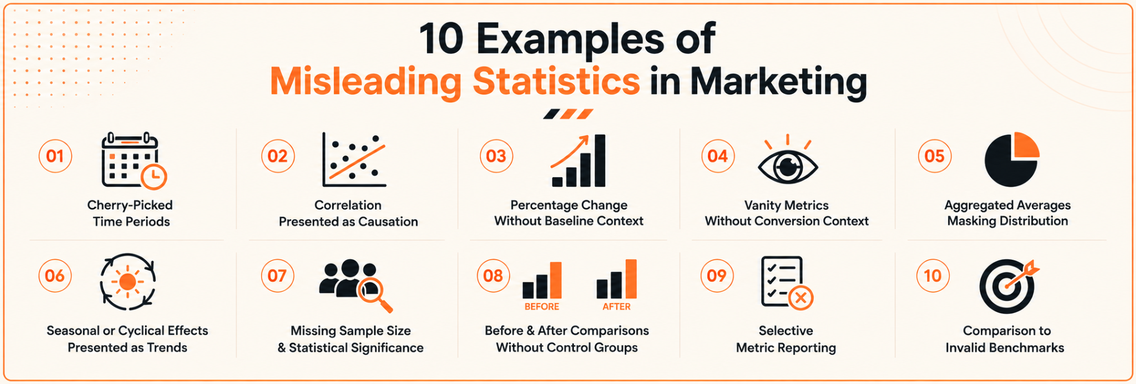
6. Seasonal or Cyclical Effects Presented as Permanent Trends
Seasonal lifts are not the same as durable growth. A campaign that lands in a peak period can make a channel look far stronger than it really is, especially if the chart begins at the seasonal high and ends before the decline. That mistake is common in retail, B2B demand gen, and service businesses with predictable buying cycles.
The broader statistical lesson is already visible in classic misleading-statistics coverage, where selection and comparison frame do most of the damage. Many explainer pages cover the obvious tricks, but they rarely show how a real metric can be accurate and still deceptive when the cycle is ignored (overview of misleading statistics patterns). That gap matters in marketing because seasonal demand can look like strategy brilliance.
How to spot a trend that’s really a cycle
An e-commerce team can celebrate a holiday spike and call it a new baseline, even though the result predictably cools once the season passes. A B2B team can point to January lead volume without acknowledging that budgets reset at the start of the year. A healthcare practice can see more patient acquisitions at the start of a new year and over-attribute the lift to a redesign.
A Corrected Visual should overlay the current period with the same month or quarter from prior years, then annotate the seasonal events that likely influenced demand. That makes the cycle visible instead of burying it in a smooth line. For planning, the takeaway is to build different expectations for peak periods and non-peak periods, then test new tactics outside the obvious spike window.
“Seasonal results can prove timing, but they don’t prove durability.
If an agency presents a seasonal win as a permanent uplift, ask for the year-over-year comparison and the off-season baseline. A durable channel can survive the dip. A seasonal tactic can’t.
7. Missing Sample Size and Statistical Significance
A result from too few observations can look decisive when it’s really just noise. That happens in A/B tests, survey feedback, and social reactions all the time. Marketers love quick wins, but quick wins without enough data can send the team down the wrong path.
The danger is not hypothetical. A test with a tiny conversion count can easily produce a winner that disappears when more traffic arrives. That’s why statistical significance matters, because it helps distinguish true differences from random fluctuation. Without it, a chart becomes a mood board.
Small samples make confident-sounding nonsense
A landing page test can show a big lift early, only to collapse once enough visitors are added. A social post can collect a flurry of replies from a small slice of the audience and be mistaken for broad demand. A survey can be treated like market truth even when the sample is too thin to support the conclusion.
A Corrected Visual should show confidence intervals, sample size, and the test duration alongside the result. It should also show where the result sits relative to the error band, not just the point estimate. In practice, that forces the team to ask whether the “winner” is statistically credible or just temporarily lucky.
“Don’t name a winner until the sample can support the claim.
For agency reports, the strategic takeaway is strict. Ask for significance thresholds, confidence intervals, and the stop rule before the test starts. If the team keeps checking results and stopping when the chart looks good, the analysis is vulnerable to optional stopping bias, which makes the conclusion look cleaner than it is.
8. Before and After Comparisons Without Control Groups
Before and after charts feel persuasive because they’re easy to read. The trouble is that they almost never isolate the intervention from everything else happening at the same time. If the market moved, competitors changed, or an outside event reshaped demand, the comparison no longer proves what the presenter says it proves.
Excellorix’s discussion of testing before redesigning points to the same core issue, a redesign or optimization effort needs a fair comparison environment, not just a flattering end state (website conversion rate optimization case study on testing before redesigning). That principle is bigger than websites. It applies to every channel where performance changes after a launch.
Why the control group matters
A traffic lift after a paid search rollout might come from PR coverage. An email lift after segmentation might reflect the fact that less engaged users removed themselves from the list. A redesign that appears to improve conversion may coincide with broader market improvement, which means the website gets credit for a trend it didn’t create.
A Corrected Visual should place the treatment group beside a holdout or matched control group, so the audience can see the gap between what changed and what would likely have happened anyway. That makes causality more defensible and reporting more honest. If a vendor can’t show a control, they should at least show a tightly matched pre-period and document external changes.
- Use holdouts whenever possible: Even a partial control beats none.
- Match the comparison period carefully: Same season, same audience, same channel mix.
- Record external events: Product launches, outages, press coverage, and market shocks all matter.
- Ask for the control story first: If it’s missing, the result is incomplete.
9. Selective Metric Reporting
Selective reporting is one of the most common ways agencies make a weak campaign look healthy. They choose the metric that improved, then leave out the one that worsened. The result feels transparent because a real number is shown, but the overall picture is still distorted.
Balanced scorecards beat vanity dashboards. A PPC report that celebrates quality score while ignoring declining efficiency is not a full report. An email report that leads with opens while hiding weak clicks and conversions is doing the client a disservice. The audience gets a highlight reel, not the film.
How to catch the omission
Read reports like a skeptic and look for missing counter-metrics. If the headline is engagement, ask about acquisition cost. If the headline is ranking improvement, ask about traffic and conversions. If the headline is click performance, ask what happened to revenue.
A Corrected Visual should present leading and lagging indicators side by side, so one strong metric can’t be used to conceal a weak one. That makes it easier to see whether the campaign is healthy or merely well-packaged. For agency review, the key question is blunt, what other metrics exist that we’re not discussing?
“A metric that improves while the business outcome worsens is not a win.
The strategic takeaway is to define your own KPIs before the vendor starts reporting. If the agency chooses the metric stack alone, it can always find one number that flatters the work. If you control the scorecard, the conversation stays anchored to revenue, efficiency, and customer quality.
10. Comparison to Invalid Benchmarks
A stat becomes misleading when it’s compared to the wrong peer group. That’s a subtle but common trick, especially in marketing where “industry average” can mean almost anything. A niche B2B software company, a healthcare startup, and a retail store do not belong in the same benchmark conversation.
The issue is visible in benchmark-heavy advice about conversion rates, because a business can look strong only by choosing a weak comparison pool. Excellorix’s benchmark guide for ecommerce conversion rates exists for that reason, peer context has to be relevant, not convenient (ecommerce conversion rate benchmarks, drivers, and fixes). If the benchmark doesn’t match the business model, size, or lifecycle stage, it stops being useful.
Why a bad benchmark can flatter bad performance
A B2B SaaS team may claim success because its conversion rate beats a mixed benchmark that includes consumer retail traffic. A professional services firm can make lead generation look cheap by comparing itself to completely different verticals. A young healthcare company may praise retention against early-stage peers when it should be measuring against the behavior of mature companies in the same category.
A Corrected Visual should show the benchmark source, the peer group definition, and at least one internal comparison line so the audience can see whether the result is strong or just selectively framed. The best benchmark is usually a direct competitor set or a carefully matched internal historical baseline. If the benchmark can’t be defended in plain language, it’s probably doing more marketing than measuring.
- Match industry and business model: Same category, same buyer behavior.
- Match company size and maturity: Startups and established firms shouldn’t be blended casually.
- Validate the source: Know exactly where the benchmark came from.
- Prefer internal trend lines: Your own history is often the most relevant peer.
Comparison of 10 Misleading Statistics
| Technique |  Implementation complexity Implementation complexity |  Resource requirements Resource requirements |  Expected outcomes Expected outcomes |  Ideal use cases Ideal use cases |  Key advantages Key advantages |
|---|---|---|---|---|---|
| Cherry-Picked Time Periods | Low, simple selection of dates | Low, uses existing reports | Short-term uplift that may be unsustainable | Highlighting seasonal campaign wins or milestone summaries | , attention-grabbing, easy to produce |
| Correlation Presented as Causation | Medium, narrative framing required | Medium, needs analytics to investigate | False attribution risk; misleading decision signals | Hypothesis generation or promoting suspected wins (requires follow-up testing) | , can surface hypotheses worth testing |
| Percentage Change Without Baseline Context | Low, compute percent change only | Low, minimal data needed | Inflated perception; small absolute impact despite large % | ||
| Early-stage growth reports or proof-of-concept summaries (with caution) | , highlights proportional gains but can mislead | |||
| Vanity Metrics Without Conversion Context | Low, track easy KPIs | Moderate, requires full-funnel tracking to validate | High surface metrics with weak revenue linkage | Brand awareness reporting or top-of-funnel snapshots (should be paired with conversion metrics) | , simple to track and show reach |
| Aggregated Averages Masking Distribution Problems | Medium, needs segmentation analysis | Moderate, requires granular data and tooling | Hides variation; masks underperforming segments | Executive summaries when followed by segmented deep dives | , useful as a high-level snapshot only |
| Seasonal or Cyclical Effects Presented as Permanent Trends | Low-Medium, temporal framing | Moderate, needs historical seasonality data | Temporary spikes misrepresented as new baselines | Planning around known seasonality; short-term campaign reports (with YOY context) | , identifies seasonal opportunities if contextualized |
| Missing Sample Size and Statistical Significance | Medium-High, requires statistical methods | High, needs sample collection and testing platforms | Unreliable conclusions and high false-positive rate | Early signal detection or rapid iteration if treated as hypothesis only | , enables fast iteration but not definitive proof |
| Before/After Comparisons Without Control Groups | Low, simple pre/post comparison | Low, no additional setup for controls | Ambiguous attribution; external factors confound results | Quick case studies or internal storytelling (not for firm attribution) | , easy to communicate but low rigor |
| Selective Metric Reporting | Low, choose favorable KPIs | Low, uses available metrics | Skewed perception of campaign health; missing context | Short client updates or highlights reel (should be balanced) | , emphasizes strengths; simplifies messaging |
| Comparison to Invalid Benchmarks | Medium, requires benchmark selection | Moderate, research and data sourcing | Misleading relative performance; poor peer fit | Competitive analysis if true peers are available; otherwise risky | , useful when benchmarks are accurate; misleading otherwise |
From Deception to Decision Making Honest Data
Recognizing misleading statistics is the first step toward building a marketing strategy based on truth. The pattern across every example is consistent, a number can be technically correct and still lead a team in the wrong direction when the denominator, the time frame, the sample, or the comparison group is hidden. That’s why the most useful question in reporting isn’t “Did the metric go up?” It’s “What, exactly, does this metric prove?”
For marketers and operators, honest analysis starts with context. Time windows should be broad enough to show trend, not just flash. Percentages should be paired with absolute values. Conversion metrics should be tied to revenue, not vanity. Benchmarks should be relevant to the business model, not borrowed from a prettier category. Once those rules are in place, the report stops being a persuasion tool and starts becoming a decision tool.
That shift matters because weak measurement creates weak strategy. Teams overfund channels that only look good in isolated slices. They reward agencies for flattering dashboards instead of durable outcomes. They mistake temporary spikes for repeatable systems, then wonder why growth disappears when the market changes.
The better path is transparency. Use full-funnel reporting, compare like with like, and insist on control groups where possible. When a vendor can show the post-click path, the baseline, the segmentation, and the benchmark logic, the conversation becomes much more productive. That’s the standard Excellorix pushes through its conversion-focused reporting, testing, and revenue-driven growth systems, because marketing only works when the numbers reflect reality instead of theater.
If you want reporting that shows the whole picture, not just the flattering slice, talk to Excellorix. Their team builds revenue-focused marketing systems across design, SEO, paid media, and conversion optimization, so you can evaluate performance with cleaner data and act on what’s driving growth.