Skip to content



Fewer than 2 in every 100 visits turned into a purchase on average in September 2024, with the global ecommerce conversion rate at 1.58%. That’s the number that should reset your thinking, because it means the business isn’t won or lost in broad strategy decks, it’s won or lost in tiny moments of friction on product pages, in checkout, and in traffic quality. The same benchmark also moved from 1.84% in January to 1.58% in September that year, which is a reminder that conversion is not a fixed property of a store, it’s a moving target shaped by execution and demand. Oberlo’s ecommerce conversion benchmark
If you’re still looking at one headline conversion number and calling it a day, you’re missing the full diagnosis. The useful move is to split the metric by device, source, customer type, landing page, and funnel step, then attack the leak that exists instead of shipping generic CRO theater.
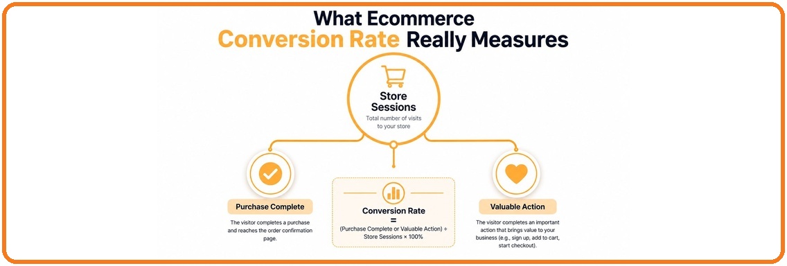
What Ecommerce Conversion Rate Really Measures
Ecommerce conversion rate is the share of store sessions that end in the valuable action you care about, usually a purchase. The denominator matters. If you use sessions, you’re measuring how well your site turns visits into orders. If you use visitors, you’re measuring people instead of visits, which tells a different story. If you use pageviews, the number gets distorted fast and is usually less useful for an ecommerce operator.
That’s why you need to know which event you’re tracking. A purchase conversion rate tells you how many sessions became orders. An add-to-cart rate tells you how many sessions reached product intent. A checkout completion rate tells you how much friction exists after the buyer has already said yes. Those are not interchangeable.
Start with the right denominator
If you run a Shopify store, the most practical default is session-based conversion, because that’s the clearest read on how the site performs against the traffic it receives. For a lead-gen site, that same definition is less useful, because the valuable action isn’t a sale, it’s a form fill, call, or booked appointment. Don’t copy someone else’s metric and pretend it means the same thing in your stack.
“Practical rule: if your analytics dashboard can’t tell you whether the problem sits in the product page, cart, or checkout, the number is just a scoreboard.
Order value changes how you interpret the metric too. A store can have a modest conversion rate and still be healthy if the basket is strong. New visitors and returning visitors also behave differently, so a blended number can hide the fact that first-time traffic is underperforming while repeat buyers carry the average.
For a plain-English primer on how this fits into broader optimization work, the best companion piece is this guide to conversion rate optimization. Pull your own number from analytics, confirm the denominator, then break it into the micro-events that explain where the leak starts.
Benchmarks You Can Trust in 2026
The global number works as a baseline, not a goal. A widely used benchmark puts the average ecommerce conversion rate at 1.58% as of September 2024, down from 1.65% in August 2024 and 0.47 percentage points lower than a year earlier. That same dataset moved from 1.84% in January to 1.58% in September, which is a good reminder that this metric shifts enough that month-to-month context matters. Oberlo’s benchmark coverage
Peer group fit matters more than the global average. Statista reported that in Q4 2024, food and beverage ecommerce sites converted at 3.1%, while beauty and skincare converted at 3.0%. Across all selected sectors, the average was just over 2%, and the UK sat at 3.1% while Switzerland was 2.9%. That spread is the point. Your catalog, market, and device mix shape the number more than any generic “good” benchmark. Statista’s category and market benchmark
Benchmark snapshot
| Segment | Conversion Rate | Period |
|---|---|---|
| Global ecommerce average | 1.58% | September 2024 |
| Global ecommerce average | 1.65% | August 2024 |
| Global ecommerce average | 1.84% | January 2024 |
| Food and beverage | 3.1% | Q4 2024 |
| Beauty and skincare | 3.0% | Q4 2024 |
| UK | 3.1% | Q4 2024 |
| Switzerland | 2.9% | Q4 2024 |
That table should not push you toward a vanity target. It should force a harder question, whether you are comparing yourself to the right slice of the market. A store selling routine replenishment in a mature market is playing a very different game from a discovery-led brand with cold traffic and a longer consideration cycle.
“My take: a benchmark is useful only when it narrows the question. If it does not tell you which segment to inspect, it is just decoration.
The blunt read is simple. A move from roughly 2% to 3% can improve sales efficiency, but only if traffic quality and margins support it. The smarter question is not, “What is a good ecommerce conversion rate?” It is, “What is normal for my traffic source, my market, and my device split?”
Why One Sitewide Number Lies to You
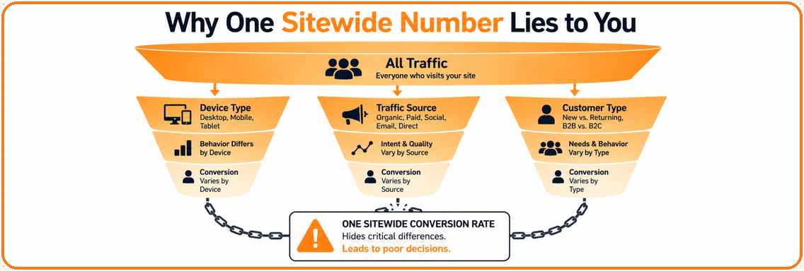
A single sitewide conversion rate is a summary, not a diagnosis. It can hide a healthy email engine, a broken paid social funnel, and a mobile checkout mess all in the same line item. That’s why segmentation is the whole game.
The diagnostic frame is simple. Break conversion down by device, traffic source, customer type, landing page, and funnel step. That’s not busywork, it’s the fastest way to find whether the leak lives in discovery, product evaluation, cart friction, or checkout failure. The current playbooks say the answer is to look beyond the storewide average, because averages hide the leak. Tagada’s segmentation guidance
Build the split that actually helps
Start with device. Then traffic source. Then new versus returning visitors. After that, move to landing page and funnel step. In practice, that means checking whether a cold paid-social audience is underperforming while email and direct are fine, or whether mobile is dragging the average while desktop is healthy. If you only stare at the blended number, you’ll solve the wrong problem.
Mobile deserves special attention because it often drives most traffic while converting at a weaker rate than desktop. The exact gap depends on your store, but the operating assumption should be that mobile needs a different fix set, not a prettier desktop layout scaled down. Paid social also behaves differently from email or direct, so mixing them into one number makes the headline rate look like a verdict when it’s really just a blended average.
Here’s the segmentation template I’d use in a spreadsheet or dashboard:
- Device split: mobile, desktop, tablet.
- Source split: paid social, organic search, email, direct, referral.
- Customer split: new, returning, logged-in.
Landing split: homepage, PDP, collection page, blog, paid landing page. - Funnel split: product view, add to cart, checkout start, payment step, purchase.
If you want a deeper experimentation stack for Shopify checkout work, this AI checkout optimization resource fits naturally into the same workflow. The point is not to collect more charts. It’s to isolate the leak before you spend time and money fixing the wrong surface.
The Levers That Actually Move the Number
The levers that move ecommerce conversion rate are boring in the best way. They’re speed, clarity, friction removal, and trust. Anything else is secondary until these are handled.
Speed first, because delay creates abandonment
Adobe’s ecommerce guidance says to aim for page loads under two seconds, use CDN delivery, and improve Core Web Vitals like CLS and TTI. The same guidance cites Deloitte and Google-derived reporting that a one-second delay can reduce conversion rate by 7% or more. That’s why speed work is not a nice-to-have polish project, it’s a direct revenue task. Adobe’s CRO guidance
Prioritize image compression, code minification, and removal of render-blocking JavaScript before you start debating button colors. If the page stutters, buyers bail before they even evaluate the offer.
Product pages need to answer objections fast
The product page has one job, remove doubt. Clear imagery, benefit-led copy, visible reviews, size guidance, and video all help, but only if they’re positioned where buyers look. If the page hides the answer to the main question, the session dies there and the cart never gets a chance.
Checkout should feel invisible
Shopify’s guidance points to guest checkout, fewer form fields, and payment options like Google Pay and PayPal as practical ways to reduce friction, while surprise shipping fees remain a classic conversion killer. Baymard and Adobe both stress trust signals such as reviews, testimonials, and clear shipping information because they lower perceived risk at the point of purchase. Behavior tools like heatmaps, session recordings, and form analytics help you see where the drop-off happens. Shopify’s ecommerce conversion guidance
“Direct advice: don’t add another CRO test until you know which field, which message, or which step is causing the exit.
Merchandising and personalization come after the basics
Personalization and merchandising matter, but they’re amplifiers, not rescue tools. If the underlying path is slow or confusing, dynamic content won’t save it. If the path is clean, good recommendations and tighter merchandising can improve progression through the funnel.
If you’re deciding what to ship first, go in this order, speed, product clarity, checkout simplification, trust signals, then personalization. That sequence reflects how buyers experience the store, not how teams like to organize Jira tickets.
Two Brands, Two Different Wins
A mobile-led apparel brand I worked with had a weak sitewide number, and the team assumed checkout was the villain. It wasn’t. Session replays showed people trying to zoom images, open size guidance, and understand fabric fit on the product page, then giving up before add-to-cart. The fix was to make the product story easier to consume on mobile, not to rebuild checkout from scratch.
The apparel store had a product page problem
The team added more obvious size guidance, moved key fit details higher, and made product video easier to find. That changed the quality of the product page conversation, because shoppers weren’t forced to hunt for the information that resolved doubt. The lesson was blunt. When mobile traffic is doing the browsing, the product page has to carry more of the sale.
A separate lesson came from a supplements brand with strong email traffic and weaker paid social performance. Email visitors were already warm, so they converted relatively well. Paid social visitors, on the other hand, were hitting checkout friction because shipping expectations weren’t set early enough, and the surprise on the final step was enough to kill momentum. The team changed what buyers saw before checkout, not just what they saw on checkout.
The supplements brand had a checkout expectation problem
That brand’s issue wasn’t lack of demand. It was a mismatch between acquisition promise and checkout reality. Once the shipping message was made clearer earlier in the journey, the paid traffic stopped falling off for a reason the team could control. The same headline conversion rate would’ve told you nothing without the segment split.
I’d use that same logic on my own store before touching anything else:
- If mobile is weak: inspect product page clarity and tap behavior first.
- If email is strong but paid social is weak: inspect landing page promise and shipping or payment friction.
- If add-to-cart is healthy but checkout completion is soft: inspect forms, fees, and payment options.
- If a single landing page underperforms: inspect that page before blaming the whole site.
For a real-world example of how segmented diagnosis changes the intervention, this case study on conversion improvement is the right kind of read. The pattern is always the same. The headline number looks generic, the fix is specific, and the specific fix wins.
A Practical 30-60-90 Day CRO Plan
Start with measurement, not redesign. If you don’t know where the leak sits, you’ll spend the first month guessing in public.
Days 0 to 30, instrument and inspect
Set up the split views in analytics for device, source, customer type, and funnel step. Then use heatmaps, session recordings, and form analytics to watch real sessions instead of debating screenshots in a meeting. The goal here is clarity, not polish.
“Rule: if a team can’t point to the exact step where users drop, it’s not ready to test yet.
Days 31 to 60, ship the obvious wins
Fix the biggest speed issue first if there’s a clear one. Then tighten checkout. That usually means simplifying forms, reducing surprises, and making payment options easier to access. Don’t run six experiments at once and call it strategy.
If you’ve got one clear product page issue, handle that too. But keep the scope narrow enough that you can tell what moved the number and what didn’t.
Days 61 to 90, test with discipline
Write one hypothesis per test. Tie each hypothesis to a visible friction point and one metric. If you’re testing checkout changes, use checkout completion. If you’re testing product page changes, use add-to-cart and downstream purchase conversion. That keeps the experiment honest.
Use a simple decision rule. If the change doesn’t improve the chosen metric and doesn’t create a meaningful secondary win, cut it and move on. CRO gets dangerous when teams keep dead ideas alive because they liked the design.
If you want the operating cadence in one line, it’s this. Measure, remove friction, then test what’s left.
Putting It All Together
Treat ecommerce conversion rate as a leak detector, not a performance grade. The blended number matters, but only after you split it by device, traffic source, and funnel step so you can see where the damage starts. Once you know that, the fix is usually obvious, speed, product clarity, checkout simplicity, or trust.
This week, pull the segmented view and find the worst leak. This month, fix the thing that’s causing the most friction, not the thing that looks easiest in a meeting. This quarter, build a testing cadence so every change teaches you something about your store instead of just changing the layout.
Excellorix builds revenue-focused growth systems for ecommerce brands that need sharper measurement, faster pages, cleaner checkout flows, and CRO work that connects directly to sales. If you want a partner that can audit the funnel, improve the Shopify experience, and turn the diagnosis into action, visit Excellorix and talk through the gaps in your store.