Skip to content



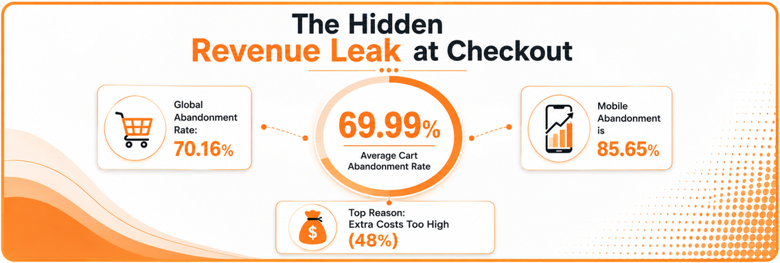
70.19% of shoppers who add items to a cart leave before completing the purchase, according to Baymard Institute’s long-running checkout research checkout usability benchmark. That’s not a minor UX nuisance, it’s a revenue leak concentrated at the exact point where intent is highest and tolerance for friction is lowest.
In practice, ecommerce checkout optimization isn’t a polish project. It’s the work of removing the specific barriers that stop ready-to-buy shoppers from paying, whether those barriers are visible, like too many form fields, or invisible, like slow payment authorization and unstable frontend behavior.
Why Checkout Optimization Is Your Highest-Impact Conversion Point
The average global cart abandonment rate is 70.19% in 2024, based on Baymard Institute’s aggregation of 49 studies and 14 years of continuous tracking checkout usability benchmark. Baymard also reports that a large ecommerce site can increase conversion by up to 35.26% with better checkout design alone. Those two facts reframe the whole discipline, because checkout is one of the few places where design, payment reliability, and revenue connect directly without waiting for more traffic.
The core problem is structural, not cosmetic
Baymard’s 2024 abandonment research points to specific friction. 48% leave because extra costs are too high, 26% because they’re forced to create an account, 25% because they don’t trust the site with payment information, and 24% because the process is too long or complicated checkout optimization statistics. That mix matters because it shows the loss is not random. It comes from predictable UX and payment-layer failures that repeat across stores.
The average checkout flow still has 5.08 steps, often rounded to 5.1, and that has not changed since 2012 checkout optimization statistics. That stability is the signal. The industry has spent years talking about simplification while leaving the main friction points in place.
“Practical rule: treat checkout as its own conversion system. If you only review it during a redesign, you are usually too late to catch the issues that are costing you money every day.
What actually moves revenue
Checkout optimization works because it attacks the final, highest-intent part of the journey. A shopper who has already put items in cart has done most of the hard psychological work. At that point, a hidden shipping fee, a forced account wall, a slow payment processor, or an authorization failure is enough to kill the sale.
That is why the business case is stronger than it looks in a slide deck. You are not trying to convince cold traffic to care. You are removing blockers from people who have already said yes to the product. In many stores, that produces a better return than spending more on acquisition, because the traffic is already there and the leakage is measurable.
For a useful starting point, an audit framework for diagnosing conversion leaks helps separate checkout friction from broader site issues. The right mindset is simple. Checkout optimization is not about making the page prettier, it is about making the purchase finishable.
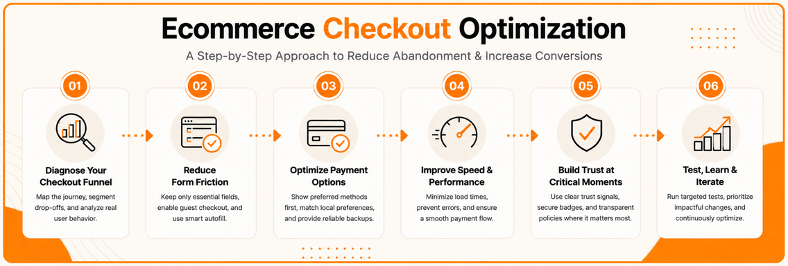
Diagnosing Your Checkout Funnel Before Making Changes
A checkout that looks polished can still leak revenue in the payment layer or stall before the page becomes usable. Before changing a single field or payment module, measure where the flow breaks. A checkout audit that skips baseline data usually turns into opinion, and opinion is expensive when every change affects revenue. Start by instrumenting the full path from cart to authorization, then inspect where shoppers stall, retry, or disappear.
Map the flow step by step
A useful diagnosis starts with a literal map of the journey as it exists today. Record each stage, account choice, shipping details, payment selection, review, and confirmation, then compare completion between steps. The practical question is whether shoppers can move through the flow without confusion, delay, or an unexpected handoff to a slower payment screen.
The right metric is the step with the steepest fall-off, not the number of screens. A one-step flow can still underperform if the payment layer is unstable, while a multi-step flow can work if it is predictable and clearly labeled. That is why the first pass should separate user-interface friction from payment processing friction, including the gap between click and the point where the checkout becomes interactive enough to continue.
Baymard’s guidance on checkout flow UX stresses linearity, clear progress, and safe backward navigation, because shoppers drop when they cannot tell where they are or what happens next checkout flow UX optimization.
Audit framework for diagnosing conversion leaks
Segment the abandonment, don’t average it away
Aggregate abandonment hides a lot. Mobile shoppers behave differently from desktop users, returning customers behave differently from first-time buyers, and traffic from paid campaigns often behaves differently from organic traffic. If your analytics stack supports it, break the funnel into those segments and compare drop-off step by step.
You are looking for patterns that separate structural friction from situational friction. Structural friction affects almost everyone, like a badly timed payment redirect, a review step that resets the page, or a gateway that adds visible delay before authorization. Situational friction hits only some groups, like mobile keyboard issues, local address formats, or a payment method mismatch for a specific market.
“If a segment fails at the same place every time, that is usually a product issue. If the same shopper fails on different devices, it is often a flow issue.
Track what users actually experience
The most useful checkout metrics are completion rate, step abandonment, frontend errors, wallet failures, and authorization latency. If a shopper clicks pay and waits for a response, that wait is part of the checkout experience even if the page looks unchanged.
Performance work matters here because a checkout can be visually tidy and still lose buyers if the page takes too long to become usable or if payment authorization drags. I have seen teams spend weeks on field labels while the actual loss came from a slow script bundle or a processor that made the final step feel broken. The point of diagnosis is not to create a prettier dashboard. It is to identify the first place where the buyer loses confidence or patience, then fix the constraint that directly blocks the order.
Reducing Form Friction Without Losing Critical Data
Checkout forms usually fail in two ways. Teams keep too much because they are afraid to remove anything, or they cut fields too aggressively and break the information they still need. The better approach is to separate essential, conditional, and optional data, then keep only what supports fulfillment, payment, and recovery.
Keep the fields that earn their place
Baymard’s checkout research repeatedly points to visible effort as a conversion killer, especially when shoppers are forced to work harder than necessary to complete the order checkout flow UX optimization. The common win is not a dramatic redesign, it is a hard review of whether each field serves a business purpose.
A useful test is simple, if a field does not help process, deliver, or confirm the order, it is probably decoration. That does not mean every extra field is bad, but it does mean every extra field needs a reason stronger than habit or internal preference.
- Email address: keep it, because order confirmation depends on it.
- Shipping address: keep it, because fulfillment depends on it.
- Phone number: make it conditional if it is only needed for specific delivery types or markets.
- Company name: keep it only where B2B ordering is relevant.
- Discount code field: do not let it dominate the page if most buyers do not have one.
Guest checkout should be the default path
Forced account creation remains one of the clearest abandonment triggers. Baymard’s research places account friction among the major causes of cart loss, and guest checkout still belongs in the default path. The operational fix is straightforward, let shoppers buy first, then invite registration after the order is placed.
That post-purchase prompt works because the customer has already committed. At that point, account creation feels like a convenience, not a hurdle. Asking for a password after the sale is a very different experience from asking someone to create one before they can pay.
Field-level changes that usually help
Address autocomplete reduces typing and error risk, especially on mobile. Smart defaults, like billing matching shipping unless the user changes it, remove redundant effort. Inline validation matters too, because recovering from one field error is much easier than getting a vague failure message after submission.
For teams that need a more formal decision model, a field framework helps:
| Category | What to do | Why it matters |
|---|---|---|
| Essential | Keep and label clearly | These fields support payment, fulfillment, or confirmation |
| Conditional | Optimize or hide until needed | These fields should appear only when the context requires them |
| Optional | Remove unless there is a proven use case | These fields create work without helping the transaction |
Track what users experience
The most useful checkout metrics are completion rate, step abandonment, frontend errors, wallet failures, and authorization latency. If a shopper clicks pay and waits for a response, that wait is part of the checkout experience even if the page looks unchanged.
Performance work matters here because a checkout can be visually tidy and still lose buyers if the page takes too long to become usable or if payment authorization drags. I have seen teams spend weeks on field labels while the actual loss came from a slow script bundle or a processor that made the final step feel broken. The point of diagnosis is not to create a prettier dashboard. It is to identify the first place where the buyer loses confidence or patience, then fix the constraint that blocks the order.
Payment Method Strategy by Market and Device Type
Generic advice to “offer more payment methods” is too vague to be useful. What matters is which methods match your market, your device mix, and the fallback behavior when a preferred option fails. A store that sells mostly on mobile to wallet-heavy buyers should structure the checkout differently from a business that serves international desktop traffic with mixed preferences.
Put the primary method in the right place
Express wallets such as Apple Pay and Google Pay are valuable because they remove card entry entirely and let the shopper authenticate quickly. For mobile-first stores, those methods deserve prominent placement near the top of the checkout, not buried below a long card form. Independent summaries of checkout optimization also note that wallet additions can improve mobile conversion materially, though the exact impact depends on audience and implementation checkout optimization for ecommerce.
That doesn’t mean wallets should replace card entry. Cards still need to be available as the fallback path, and the interface should make that choice explicit. The best payment section is simple, visible, and predictable.
Match payment options to the market
Payment priorities vary by geography, device, and shopper expectations. Shopify’s checkout guidance emphasizes express checkout, autofill, and local payment methods because a generic payment stack doesn’t serve every market equally well ecommerce checkout. A brand that expands internationally should treat payment method selection as a market test, not a one-time platform setting.
The practical trade-off is between convenience and coverage. Too few methods create friction when the shopper can’t use their preferred option. Too many methods can clutter the page if the hierarchy is poor or the default choice isn’t obvious.
Build fallback logic into the flow
The failure case matters as much as the success case. If a wallet fails or a redirect stalls, the shopper shouldn’t feel trapped. Preserve entered data, show a clear alternate path, and keep the CTA label aligned with the next step. If the user chooses a third-party option, the button should say where it’s going.
“Implementation rule: payment method choice has to be reversible. If the user switches methods, none of their previous work should disappear.
A strong payment strategy doesn’t just list options. It decides which one gets attention first, how the fallback behaves, and what happens when the preferred route doesn’t complete cleanly.
Performance and Speed Factors That Undermine Good Design
A checkout can look polished and still lose money if the technical layer is slow or unstable. That’s the part many guides skip, because it’s harder to show in a mockup than a button style. In real audits, I see this all the time, the UI feels fast, but the payment step stalls long enough for confidence to collapse.
Measure the invisible delay
The useful metrics here are time to interactive and time from submit to authorization response. If the page is responsive but the payment request hangs, the shopper experiences the checkout as slow even though the design looks fine. One of the most common blind spots is assuming a shorter flow is automatically a faster flow.
That assumption breaks when the payment layer is fragile. A simpler layout can still perform worse if it surfaces front-end errors, wallet failures, or delayed gateway responses more often than the older version. The question is not “How many screens did we remove?” It’s “What happened to the actual time it took a buyer to get a valid approval?”
Watch for the failures users feel
Track frontend errors, JavaScript exceptions, wallet drop-offs, and authorization latency together, not in isolation. A payment method can appear available while failing for a subset of users. That’s especially dangerous because the checkout may look stable in internal testing and still leak conversions in production.
The structure of the flow matters too. If a field or trust element helps prevent downstream problems, removing it purely for speed can backfire. A technical simplification that raises payment errors is not an improvement, it’s a trade-off with hidden costs.
Make the technical stack part of optimization
Performance fixes usually involve boring but effective work. Lazy loading non-essential assets keeps the checkout from waiting on extras. API optimization reduces round-trip delays. Payment gateway selection matters because a provider that’s fine in a demo can become the bottleneck under real traffic and real device conditions.
The right question for the stack is whether it supports a fast, stable, recoverable transaction. That’s the difference between a checkout that merely looks modern and one that clears money into the account.
Website performance evaluation checklist
Trust Signals and Testing Framework for Sustained Gains
Trust drops fastest at the payment step, because buyers are deciding whether to hand over card details, billing data, and control of the transaction. A few credible signals placed at the point of hesitation do more than a dense block of badges tucked away in the footer. Those changes need to be tested with discipline, or teams end up defending opinions instead of learning from behavior.
Place trust where the anxiety happens
Payment distrust is a common abandonment trigger, and reassurance works best when it sits next to the form instead of far below it. A visible security label, accepted payment logos, and a short return-policy reminder belong close to the moment of card entry. That placement matters because the shopper is deciding in real time whether the checkout feels safe enough to finish.
Keep the copy honest. Fake badges and decorative seals usually create more skepticism than confidence, especially with experienced buyers. Clear, current signals do more work than clutter, and they are easier to maintain when payment rules or branding change.
Test the changes that matter first
A/B testing in checkout should start with the changes most likely to affect completion, not the ones that only look polished. Guest checkout visibility, cost transparency, and form reduction usually beat cosmetic tweaks because the buyer already has intent. If a test cannot change whether the order goes through, it is probably not the first test to run.
Use one primary success metric, then watch the failure points around it. If a change improves completion but increases payment failures, authorization latency, or support contacts, it may not be a real win. Checkout testing needs a stable definition of success, otherwise the team ships a nicer page that performs worse in practice. A plain-English CRO guide for business owners can help non-specialists understand why this discipline matters.
Use a prioritization order that compounds
A strong roadmap usually follows the same sequence. First, remove friction that blocks nearly everyone. Then fix method-specific issues, such as wallet handling or mobile input behavior. After that, refine trust elements and secondary optimizations so the gains hold up under real traffic and real payment conditions.
The point of testing is not to prove every idea works. It is to learn which friction points deserve permanent attention and which ones only look important from the outside.
Building Your Checkout Optimization Roadmap
The cleanest roadmap balances speed, risk, and impact. Quick wins should remove obvious friction, medium-term changes should address flow and payment structure, and larger technical work should target the hidden performance problems that surface after the UI is already improved. If you do it in the wrong order, you can spend weeks making the page prettier while the core issue stays untouched.
Start with the changes that unblock purchases
The first wave should focus on guest checkout, cost transparency, field reduction, and clean error recovery. Those are the changes most likely to affect completion quickly because they target known abandonment triggers. They’re also the easiest for stakeholders to understand, which makes approval faster.
The second wave should address payment hierarchy, mobile behavior, and gateway reliability. That’s where the trade-offs get sharper, because you’re no longer just simplifying a form, you’re deciding how the checkout behaves under real conditions.
Use a maintenance mindset
Checkout optimization isn’t one-and-done. Payment methods change, device patterns shift, and platform updates can introduce new friction without warning. The teams that keep winning are the ones that treat the checkout as monitored infrastructure, not a design asset that gets frozen after launch.
A practical cadence is to review funnel data regularly, test the highest-friction step first, and keep a short backlog of changes that have already been validated. If a change can’t be measured, it shouldn’t jump the queue.
Know when outside help makes sense
Some teams can handle quick wins in-house, especially if they already have analytics and development support. Others need specialized CRO and technical checkout help because the hidden friction sits in performance, payment, or implementation details that internal teams don’t have time to diagnose properly. Excellorix offers ecommerce checkout conversion optimization as part of its broader revenue-focused growth services, alongside design, SEO, paid media, and analytics support.
The goal isn’t more redesign. It’s a checkout that completes cleanly, recovers from failure gracefully, and keeps paying customers moving without unnecessary friction.
If checkout friction is dragging down your revenue, Excellorix can help audit the flow, isolate hidden performance and payment issues, and turn the findings into a practical optimization plan. Visit Excellorix to see how their ecommerce and conversion work fits into a broader growth system, then use the contact path on the site to start a checkout review.