Skip to content



Your campaign is live, the Shopify store looks polished, and the ad is getting clicks. But the landing page is converting worse than the product page or collection page you already had. The usual response is to adjust the colors or add another image. Often, the core problem is less visible: the offer, page experience, checkout path, and measurement aren’t working together.
A landing page on Shopify isn’t a standalone promotion. It sits between the ad or email that brought someone in and the product discovery, checkout, payment, and analytics tools that turn interest into a sale. Shopify facilitated about $378.4 billion in gross merchandise volume in fiscal year 2025, and Shopify Payments processed 65.6% of GMV that year, underscoring how closely campaign pages can connect to the platform’s broader commerce system (Shopify’s company history and platform context).
The practical build order is straightforward: choose the right page-building path, match the page to one offer, write for the customer’s decision, protect mobile performance, keep only useful apps, and track completed revenue. Shopify’s published benchmark material reports a 6.6% median landing-page conversion rate across industries, while email traffic converts at 19.3%. Those figures are reference points, not promises for your store. The useful question is whether your page earns more revenue from the visitors it receives.
Table of Contents
- What a High-Converting Landing Page on Shopify Needs
- Choosing the Right Build Path for Your Shopify Page
- Structuring the Page Layout and Copy That Converts
- Speed, Mobile Performance, and SEO Essentials
- Apps and Integrations That Earn Their Place
- Tracking, Analytics, and A/B Testing for Real Revenue
- Treating the Page and Checkout as One Conversion System
What a High-Converting Landing Page on Shopify Needs
A shopper clicks an ad promising a specific product benefit, then lands on a page that leads with a generic collection. That mismatch creates friction before checkout. The landing page should repeat the ad’s offer immediately, show the relevant product, and make the next step clear.
Give the page one primary job: sell a featured product, collect email signups for a launch, or capture a qualified lead. Supporting actions can remain, but they should not compete with the main conversion. If a campaign is meant to generate purchases, a “Shop now” button should carry more visual weight than a community signup form.
Practitioner’s rule: Treat every page element as part of the buying decision. If it doesn’t clarify the offer, build confidence, answer an objection, or move the visitor toward the next step, question whether it belongs.
Shopify’s landing-page analysis reports that mobile accounts for roughly 83% of landing-page visits, while desktop visitors convert about 8% better than mobile visitors. It also reports that pages loading within one second convert at three times the rate of pages taking five seconds (Shopify’s landing-page benchmarks). These broad comparisons are useful prompts, not forecasts for an individual store. Track performance by device and campaign, then compare the results against your own baseline.
The landing page, checkout, and analytics need to work as one conversion system. Visitors should recognize the ad’s offer, find the product details and terms they need, and reach checkout without unexpected costs or steps. Then measure the full path, including revenue per visitor, rather than treating bounce rate as the main verdict. A weak purchase rate may point to the offer, slow mobile rendering, unclear shipping terms, or unnecessary checkout fields, not just the page design. Use the funnel data to locate the point of friction before changing the layout.
Choosing the Right Build Path for Your Shopify Page
There are three practical ways to build a landing page on Shopify: use a theme template, add a landing-page builder, or create a custom-coded template. The best option depends on how much control the campaign needs and how often the team expects to revise it.
| Build Path | Speed | Design Control | Cost | Iteration Speed | Best For |
|---|---|---|---|---|---|
| Shopify theme template | Fast for a simple page | Limited to theme sections and settings | Usually the lowest | Straightforward, within theme controls | Product launches, basic campaign pages, and lead capture |
| Landing-page builder app | Fast once the app is configured | High, with visual editing and reusable blocks | App fees may apply | Fast for marketers working without code | Frequent campaign changes and creative tests |
| Custom-coded template | Slower to create and QA | Highest when requirements are well defined | Development time and maintenance | Depends on developer support | Bespoke experiences, complex layouts, and tightly controlled storefronts |
A theme template is often enough when the page follows your existing brand system and needs familiar sections, a product image, an offer, and a CTA. Shopify themes can support alternate templates so a campaign page can use different sections without changing every page assigned to the default template. That keeps the build relatively simple, but the design remains constrained by the theme’s available blocks.
A builder such as Shogun, PageFly, or GemPages can be useful when marketers need to rearrange content and launch variants without sending every edit to a developer. That convenience comes with a trade-off: another app to manage, another potential source of scripts, and another interface to QA after theme changes. If you’re comparing options, this overview of top landing page builders for CRO can help you evaluate tools by their editing and testing workflows rather than by template count alone.
Custom code makes sense when the campaign needs behavior that the theme and apps can’t provide cleanly, or when the page must meet strict design and performance requirements. It can also slow iteration if every change depends on a developer. Make the choice by checking your brief against a few questions:
- Campaign complexity: Can existing theme sections represent the offer clearly?
- Editing ownership: Who needs to change copy, images, or modules after launch?
- Testing plans: Will the team regularly build variants, or is this a one-off page?
- Script tolerance: Can the storefront absorb another app’s scripts and tracking?
- Maintenance: Is there support for custom code when the theme changes?
Structuring the Page Layout and Copy That Converts
Take a premium water bottle campaign as a working example. The ad targets people who want a bottle for daily commutes and outdoor use, so the page shouldn’t open with a long company history. It should show the product, state the practical value, and lead with one clear next action.
Make the offer clear before asking for a click
The hero needs a direct headline, a useful subheading, product imagery, and a CTA that names the next step. A workable headline pattern is “Get [outcome] with [product or offer]”. The subheading can explain who it suits and what makes the offer relevant. For a product page, use a button such as “Choose your bottle” or “Shop the bottle.” For a waitlist, say “Join the launch list.” Avoid vague copy like “Discover more” when the visitor needs to know what happens after clicking.
A proof bar can follow the hero: customer reviews, a concise product credential, or a relevant assurance. Use evidence the brand can substantiate. Then show the benefits in terms of use, not just specifications. Explain how the bottle fits into a commute, workout, or day outdoors, and pair that copy with images that show scale, materials, and how the product is handled.
Resolve practical questions before they become exits
The next blocks should answer predictable objections. Show the product options clearly, explain shipping expectations and returns, and make the price visible before the visitor reaches checkout. Add an FAQ for questions that matter to the purchase, not for company details that could live elsewhere. Repeat the same primary CTA after important decision points so visitors don’t need to scroll back to the top.
The page structure should shift with the conversion goal. For an email-capture campaign, make the benefit of joining explicit and keep the form focused on the information needed to follow up. For a waitlist, explain what the visitor is signing up to hear about and avoid implying immediate availability. For direct-to-cart, make product selection and price easy to understand before the CTA.
Trust signals work best when they support a decision at the moment it’s made. A review beside the hero may help a new visitor feel confident, while a clear returns statement near the product options can address purchase risk. Decorative badges or repeated claims that don’t answer a real question usually take up space without improving the buying experience.
Speed, Mobile Performance, and SEO Essentials
A campaign page can look polished on a desktop and still lose sales on a phone. Slow loading delays the offer; awkward interactions can keep visitors from reaching the Shopify checkout. Check loading speed, interactivity, and visual stability in Shopify’s web-performance reports, then judge changes by whether they improve revenue per visitor, not bounce rate alone.
Fix the mobile experience in priority order
Shopify store analysis reported that each additional 100 milliseconds of load time was associated with an approximately 3.5% lower median conversion rate. An additional 32 milliseconds of interaction delay corresponded to roughly a 1.5% conversion decline. These are reported associations, not forecasts for an individual store.
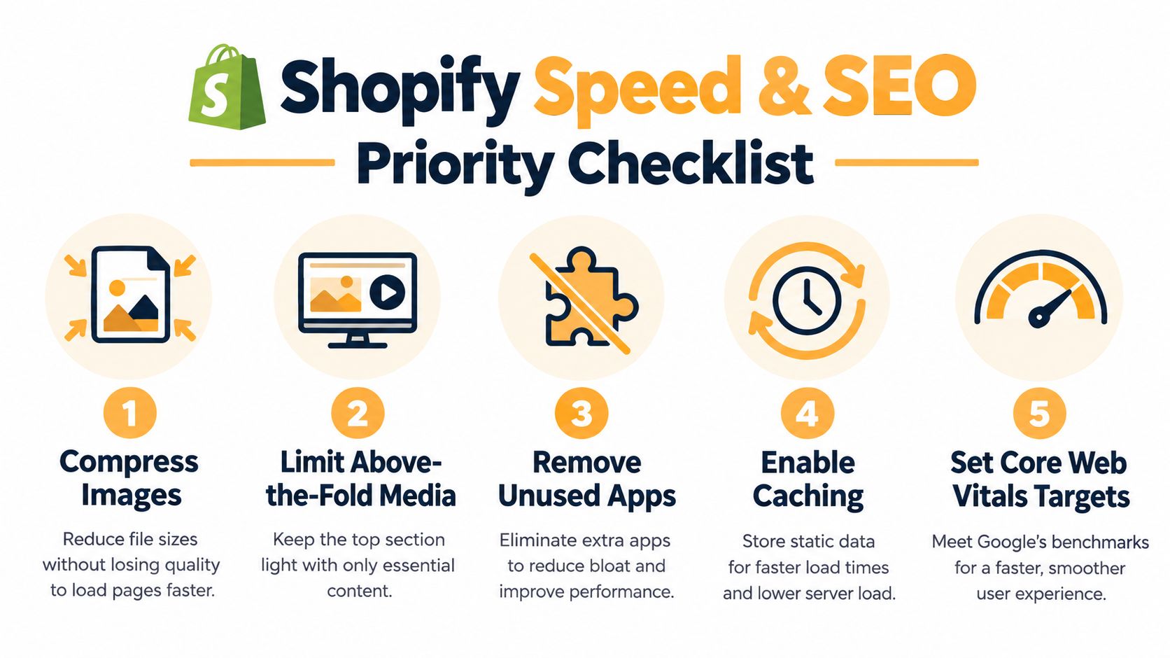
Start with oversized images. Compress them and serve dimensions suited to their display size. Avoid loading large media above the fold unless it helps explain the product. Remove unused theme sections, and question whether video, animation, or a third-party widget needs to load before a visitor can act. Defer noncritical JavaScript where your setup allows it, and check whether app scripts or advertising pixels add work without supporting the campaign.
Test on an actual phone over a throttled mobile connection. A page that feels fast on a desktop office network may be difficult to use on a mid-range device or a variable connection. Use this guide to Shopify speed optimization for technical checks, or review Excellorix’s Shopify speed optimization service if you need help diagnosing storefront performance.
Set page-level SEO instead of trusting defaults
Give the landing page a unique title tag and meta description that fit its offer and audience. Use a clear heading hierarchy, add descriptive alt text to meaningful images, and confirm that the canonical URL points to the intended indexable page. Theme defaults save setup time, but can repeat generic titles or descriptions across campaign pages.
SEO metadata does not compensate for a mismatch between the page and the searcher’s intent. Confirm that the page can be indexed when organic discovery matters, then check the rendered content and core experience on mobile before launch. Search visibility brings visitors into the system; the page, checkout, and analytics need to work together to turn that traffic into revenue.
Apps and Integrations That Earn Their Place
A reviews widget answers a buyer’s objection, but its floating tab covers the mobile purchase button. That app needs a different configuration before it belongs on the campaign page. Judge integrations across the landing page, Shopify checkout, and analytics together: useful content loses value if it interrupts buying or makes results harder to interpret.
What decision or action does this app improve, and how will we measure that?
Relevant, authentic reviews can help visitors evaluate an unfamiliar product. An email form can capture interest from people who aren’t ready to purchase. Analytics integrations can help identify where those visitors drop out. Each addition also brings maintenance, so give it a defined job rather than installing it because the template has space.
Keep video when motion demonstrates something a still image cannot explain. Start with a review snippet or a simple capture form before committing to a rotating carousel or personalized widget. For expensive or unfamiliar products, removing useful evidence can weaken the offer even if the page looks cleaner. Consent tools need careful placement too, so visitors can make their choices without losing access to the primary action.
Audit installed apps against the features this campaign uses. Disable unused embeds and check whether multiple tools send the same tracking event. For Klaviyo or Postscript forms, test submission, the intended follow-up, and the consent experience. Confirm that overlays leave the purchase path usable and that cart or checkout handoffs preserve the advertised offer.
Use Shopify’s landing-page benchmarks as background, rather than a prediction of what an app will deliver.
Before committing to an integration, compare browser network requests with its embed enabled and disabled in a preview. Check added script transfers, third-party requests, and whether assets load on pages that do not use the feature. Then judge the integration by its contribution to revenue per visitor, alongside its maintenance cost, rather than a lower bounce rate or a polished demo.
Tracking, Analytics, and A/B Testing for Real Revenue
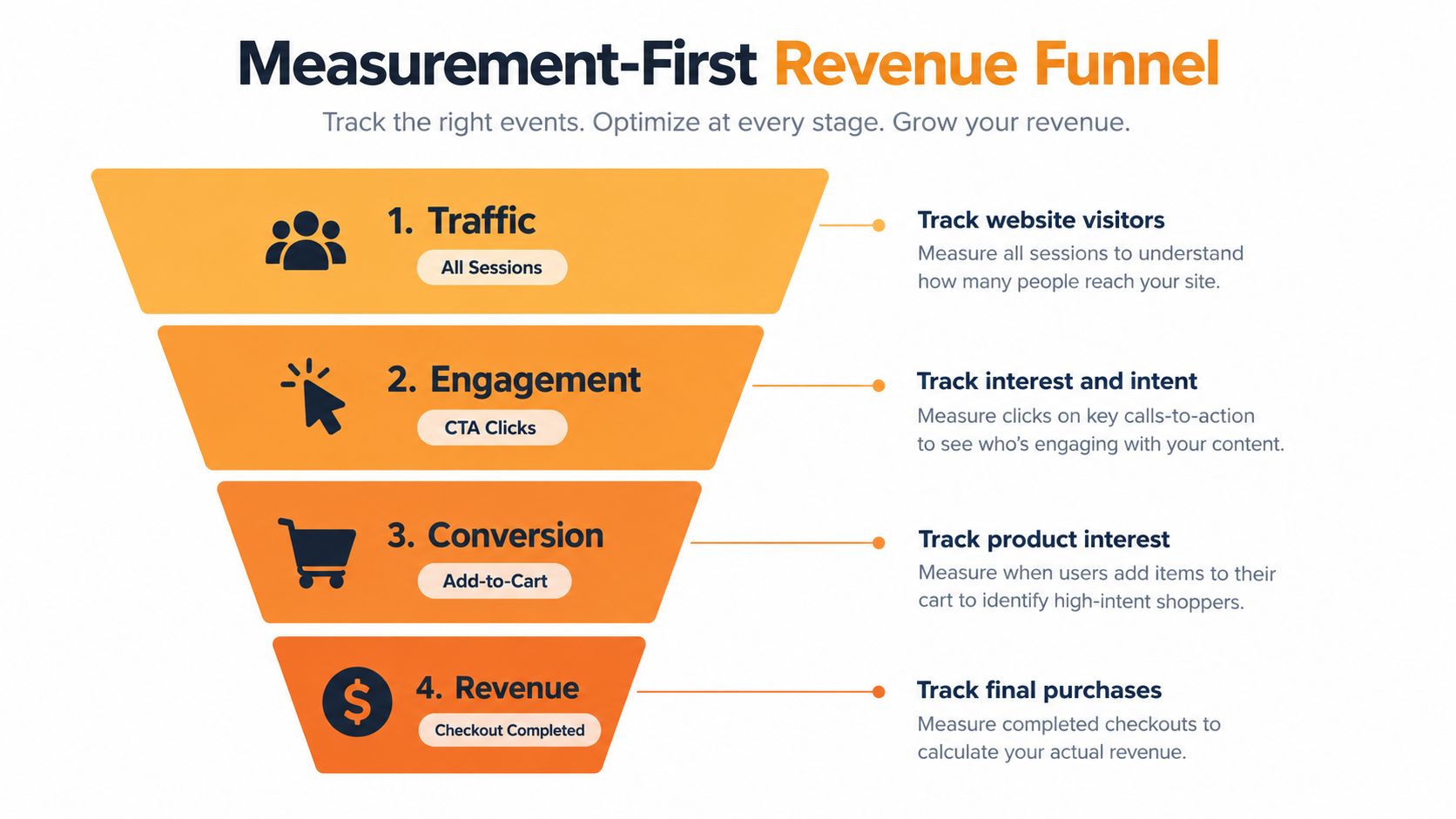
A campaign variant gets more CTA clicks, yet purchase revenue falls. Without tracking through checkout, that page can look like a winner. Before launch, choose a primary outcome, such as a completed purchase or qualified lead submission, and define the events needed to explain how visitors reach it.
Track the path to the outcome
Track CTA clicks, product views, add-to-cart, checkout initiation, and purchase as one connected funnel. Check that campaign attribution survives the journey into Shopify checkout. Record a baseline for conversion rate, order value, and revenue, then segment by device and acquisition source. A strong email audience can otherwise hide a weak paid-social experience.
Use revenue per visitor alongside conversion rate: divide revenue attributed to the page’s visitors by the number of visitors in that same group.
More clicks can accompany fewer purchases or lower-value orders. Bounce rate can flag a possible usability or message-match problem, but it does not measure the revenue generated by visitors who stay. Use Shopify’s web-performance reporting to investigate performance separately from judging test outcomes.
Test one meaningful change at a time
Start with a headline, offer framing, CTA wording, or product-proof change. Keep other elements stable and split comparable traffic between variants where possible. Sequential comparisons are more vulnerable to changes in audience or campaign conditions, so treat them cautiously. Avoid declaring a winner from a short burst of traffic.
Review device, paid-channel, geography, and new-versus-returning visitor results without treating every small subgroup as conclusive. A detailed product explanation might help high-intent search visitors while slowing returning email subscribers.
Use this guide to landing page split testing to structure variants and interpret results. Choose the version that improves the campaign’s purchase or qualified-lead outcome, with revenue per visitor keeping click gains in perspective.
Treating the Page and Checkout as One Conversion System
A shopper accepts the offer on your Shopify landing page, then reaches checkout and discovers unexpected shipping costs. The page earned the click, but the handoff lost the sale. Treat the page, checkout, and analytics as one conversion system, with consistent promises from the campaign through payment.
Baymard’s checkout usability research found that, among 344 leading US and European ecommerce sites, 65% had mediocre-or-worse checkout UX and 2% were rated good; it also estimates potential gains of about 35% in conversion from checkout improvements and reports that 22% of users abandoned overly complex checkouts, while 14% abandoned when a phone number was requested without a convincing explanation.
These findings are not Shopify-specific guarantees.
Show price, shipping expectations, returns, payment options, and relevant trust evidence before visitors commit. Send the CTA to the product or checkout path that matches the offer, including the intended variant where applicable. Check that guest checkout is easy to find. Remove unnecessary fields and explain requirements you cannot remove, working within your Shopify checkout’s customization limits.
Shorter pages are not always better. High-consideration products may need comparisons, reviews, and clear returns language, even if that information discourages some purchases. Track landing-page-to-purchase rate, checkout-start-to-purchase rate, and field-level abandonment where reporting supports it. Judge the full journey by revenue per visitor rather than bounce rate, using consistent campaign attribution to distinguish page friction from checkout friction. The ecommerce checkout optimization guide provides a practical framework for that review.
Walk through the mobile journey from product selection to payment, checking where the offer, price, or terms become unclear.
Excellorix helps ecommerce teams build Shopify landing pages, improve checkout journeys, and connect campaigns to revenue-focused measurement. If traffic is failing to become purchases, visit Excellorix to discuss testing the full conversion path.