Skip to content


Choosing a beautiful Shopify theme is not the same as designing a store that converts. A polished homepage can still bury the product, delay the first meaningful render, hide shipping information, and force mobile shoppers through unnecessary steps. The practical question isn’t “Which theme looks best?” It’s which design system removes enough friction to help qualified visitors buy.
That distinction matters across Shopify’s unusually broad ecosystem. Shopify grew from 41,000 merchants in 2012 to 2.06 million by December 2021, while independent estimates place the platform at more than 5.5 million merchants or live stores in 2025 and 2026. The platform serves merchants across 175+ countries, so a serious storefront needs flexible merchandising, mobile usability, localized trust signals, and payment visibility that can support different buying expectations. (Backlinko’s Shopify store data)
Why Most Shopify Designs Fail at Converting Visitors
The most common design mistake is treating the theme as the strategy. Teams spend weeks comparing typography, animations, and homepage hero treatments, then launch a storefront that makes shoppers work to understand what’s sold, who it’s for, why it’s credible, and what happens after they click Add to Cart.
A conversion-oriented Shopify website treats every component as part of a revenue path. Navigation determines whether shoppers find the right collection. Product photography answers questions that customers can’t ask in person. Copy clarifies benefits and objections. Buttons signal the next action. Code determines whether any of those elements appear quickly enough to matter.
Design for the buying environment
Mobile browsing makes the visual-performance trade-off more severe. A large video background may communicate luxury on a fast connection, but it can delay the product and consume attention on a smaller screen. A custom font may express the brand beautifully, yet several font files can compete with more important content during the initial render.
The answer isn’t to make every store plain. It’s to reserve visual complexity for moments that support purchase intent. Use distinctive color, photography, illustration, and editorial composition where they help shoppers understand the product or brand. Remove effects that merely decorate the path.
” Practical rule: If a design element doesn’t improve understanding, confidence, or action, it needs to justify its performance cost.
Build for a distributed market
A store serving international customers can’t assume one universal shopping pattern. Currency presentation, delivery expectations, returns, language, payment preferences, and social proof all influence trust. A rigid homepage and overloaded navigation create problems as the catalog and market footprint expand.
Start with a structure that can grow. Use clear collection groupings, consistent product information, reusable content blocks, and navigation that reflects how customers shop rather than how the internal team organizes inventory. If traffic arrives but the site fails to turn interest into action, a structured Shopify conversion audit framework can help separate acquisition problems from experience problems.
The right mental model is simple: your Shopify store is a conversion system with a visual layer, not a brochure with a checkout attached.
Choosing and Customizing the Right Shopify Theme
Theme selection should begin with the product catalog and customer journey, not the theme-store preview. A preview can look impressive because it uses carefully selected photography, short labels, and a controlled number of products. Your store may need variant-heavy product pages, filtering, subscriptions, wholesale information, editorial content, or localized messaging. Those requirements should determine the foundation.
Evaluate the theme against real templates
Create a short test using your actual content. Load a representative product, a collection with meaningful filtering needs, and the homepage content you expect to publish. Then assess:
- Mobile hierarchy: The first screen should make the product or category obvious, keep tap targets comfortable, and avoid layouts that force horizontal scrolling.
- Merchandising control: Check whether you can reorder sections, feature products, create collection blocks, and manage promotional content without editing every template manually.
- Catalog fit: A small DTC assortment may benefit from visual storytelling. A broad catalog needs efficient filtering, predictable product cards, comparison cues, and useful search.
- Content structure: Look for native support for accordions, tables, recommendations, reviews, and reusable product information.
- Code discipline: Review the theme’s loaded scripts, animation settings, image behavior, and app integrations before adding more functionality.
A free theme can be the right choice when the catalog and customer journey are straightforward. Premium themes can offer more merchandising controls and built-in components, but extra features don’t automatically create a better experience. A custom theme becomes more defensible when the business needs a distinctive information architecture, specialized product logic, complex B2B purchasing, or a brand experience that available themes can’t support without invasive modifications.
Customize in the right order
Use the theme editor for structural decisions first. Set the header, navigation, collection layout, product information order, cart behavior, and mobile stacking before refining colors and decorative details. This prevents the team from polishing a layout that later needs to be rebuilt.
A practical homepage sequence often starts with a clear value proposition and a focused entry point, followed by category or collection paths, key products, proof, and supporting brand content. The exact order depends on the business, but shoppers shouldn’t need to scroll through a cinematic introduction before reaching the reason they arrived.
Keep code changes narrow. If the editor can’t provide the required behavior, modify the relevant Liquid, CSS, or JavaScript rather than layering another app over an already capable theme. Test every change on mobile, especially sticky elements, variant selectors, drawers, and discount messaging. A custom Shopify theme decision guide is useful when the question shifts from “Can this theme do it?” to “Will this foundation keep serving the business as it grows?”
” A flexible theme is valuable only when its flexibility makes merchandising faster without making the storefront heavier.
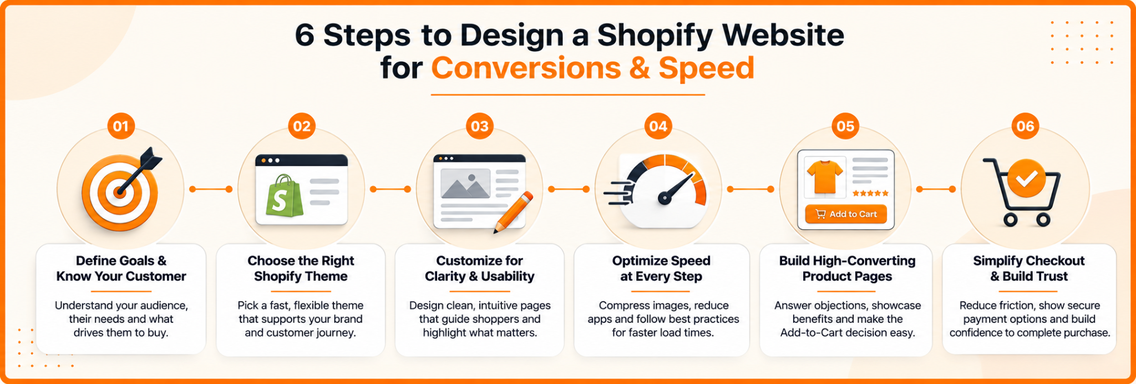
Building Page Speed Into Every Design Decision
Page speed belongs in the design brief. If the hero image, font files, app scripts, and animation libraries compete for the first render, the customer experiences the design as a delay rather than as visual polish.
Shopify performance work commonly uses Largest Contentful Paint under 2.5 seconds and Total Blocking Time under 200 milliseconds on mobile as practical targets. Many theme optimization guides also use an above-70 speed score as an internal goal, although user-impact metrics matter more than a score alone. These benchmarks and implementation recommendations are covered in Shopify’s theme performance best practices.
Measure before changing the design
Run PageSpeed Insights and Core Web Vitals checks against the homepage, highest-traffic collection, and highest-traffic product page. Don’t rely on the homepage alone. A product page with a large gallery or a collection page with extensive filtering may have a completely different performance profile.
Record the baseline, isolate one or a few changes, and test again. Use a separate theme or branch so experiments don’t compromise the live buying experience. Define the business metrics alongside the technical metrics, such as conversion rate, revenue per session, and average order value. That connection helps the team prioritize an improvement that affects customers over a cosmetic score increase.
Shopify cites research associating each 100 milliseconds of slower load time with about 3.5% lower conversion, and reports that stores with a 2.5-second LCP can see roughly 30% lower conversion than stores with a 1.5-second LCP. Shopify also highlights research indicating that removing one second from page load time can increase mobile conversions by 3%. These figures come from Shopify’s site-speed guidance, and they explain why performance decisions deserve attention before ornamental refinements.
Remove the common bottlenecks
The largest problems usually come from assets and third-party code:
- Hero images: Compress them, serve responsive variants through
srcset, and preload the critical image. Don’t lazy-load the image responsible for LCP. Shopify specifically warns that delaying the primary hero or product image harms the initial experience. - JavaScript: Defer or asynchronously load non-critical scripts. Remove unused animation libraries, tracking code, and app snippets that block rendering or delay interaction.
- Fonts: Limit the number of font files and use system fonts or
font-display: swapwhere appropriate. A font shouldn’t prevent shoppers from reading the offer. - App accumulation: Review installed apps and their theme snippets monthly. An app that no longer supports an active business process has no reason to remain in the critical path.
- Above-the-fold CSS: Inline the styles needed for the first render and postpone lower-priority styles when the implementation supports it.
The visual direction should follow the performance budget. Use motion selectively, keep product galleries purposeful, and avoid making every section interactive. The strongest storefronts don’t eliminate brand expression. They make sure the brand appears quickly and remains easy to use.
Designing Product Pages That Drive Add-to-Cart Actions
A product page has one job before the click, reduce uncertainty. Shoppers need to understand what the product is, whether it suits their needs, what it costs to receive, and why they should trust the seller. The layout should answer those questions in the order they arise, especially on mobile.
The mobile opening should show the product name, meaningful imagery, price, essential variant choices, and a clear add-to-cart action without forcing the shopper through a decorative preamble. Keep the primary button visually distinct, large enough to tap comfortably, and close to the information that supports the decision.
Structure the page around objections
Use a clear information hierarchy instead of a long promotional paragraph. A useful sequence is:
- Identify the product: State the product name and the most important differentiator.
- Show the product in context: Use a gallery that demonstrates scale, texture, fit, use, or installation where relevant.
- Explain the benefit: Translate features into outcomes without hiding technical facts.
- Clarify the purchase: Present variants, dimensions, materials, compatibility, care, delivery, and returns.
- Reinforce confidence: Place reviews, user imagery, guarantees, certifications, or service details near the decision point.
DTC pages can lead with emotion and visual context because shoppers often buy an identity, ritual, or outcome as much as a physical item. B2B and industrial pages need stronger specification architecture. Put model information, compatibility, technical drawings, lead times, downloadable documentation, minimum quantities, and inquiry paths where buyers can find them without hunting through marketing copy.
A sticky add-to-cart bar can help mobile shoppers act after reviewing details, but it shouldn’t obscure content, consent controls, or variant selection. Test whether it preserves the selected variant and communicates availability clearly.
The product page also needs to support the next decision. Related products should feel relevant, not random. Cross-sells work best when they complete a use case, while upsells should clarify the practical benefit of choosing the larger or more capable option. Reviews deserve useful filters and readable excerpts, not a decorative star row with no substance.
Optimizing Checkout UX and Payment Visibility
Checkout abandonment rarely comes from one unattractive button. It builds through uncertainty. A shopper who cannot estimate delivery, does not recognize a payment method, encounters an unexpected cost, or receives a vague form error has another reason to stop.
Independent 2026 Shopify benchmark data places typical checkout completion at about 45% to 55%, while top-decile stores can reach 60% to 75% when they combine returning-customer flows, express payments, and trust signals. Carty Labs’ Shopify checkout analysis reports these figures. Use them as diagnostic reference points, not promises, because category, traffic quality, geography, and buying intent affect results.
Remove uncertainty before checkout
The cart should confirm the order. Show product names, variants, quantities, prices, discounts, estimated shipping information, and a clear path back to edit the cart. If a shipping calculator is available, place it before the final payment step where possible.
Keep guest checkout visible. Activate Shop Pay when it suits the business and customer base, and show relevant express payment options without making the standard route harder to understand. Returning customers benefit from saved details. First-time buyers need concise forms and clear explanations.
” Checkout principle: Transparency is a conversion feature. Customers accept unavoidable costs more readily when they understand them before investing time in the form.
Use a progress indicator only when checkout has meaningful stages and the indicator reduces uncertainty. Keep labels specific, preserve entered information after validation errors, and explain corrections in plain language. A single field error should not send a customer back to the beginning.
Trust signals should support the decision rather than compete with it. Place security reassurance, returns access, customer service details, and payment logos near the point where concern is likely to arise. Too many badges can make the page look defensive, especially when they compete with the order summary.
Shopify’s enterprise marketing has cited independent consulting research indicating its conversion rate can outperform competitors by an average of 15% and by up to 36%, as reported in its enterprise marketing materials. The practical lesson is not that Shopify removes the need for testing. Storefront structure, product clarity, payment visibility, and checkout configuration must work together. Use this ecommerce checkout optimization guide to review friction across the cart and checkout.
Launching With SEO Foundations and Ongoing Optimization
A Shopify redesign shouldn’t go live with search visibility treated as a later marketing task. Search engines need a stable, understandable site structure, while shoppers need pages that load quickly and answer buying questions. The same clarity that improves discoverability often improves conversion.
Start with the architecture:
- URL structure: Keep handles descriptive, readable, and stable. Avoid changing URLs without a redirect plan.
- Collection pages: Give important collections unique titles, useful introductory copy, descriptive metadata, and strong internal links.
- Product content: Use specific names, benefit-led descriptions, structured specifications, and image alt text that describes the actual image.
- Internal links: Connect related collections, products, buying guides, and support content so customers and crawlers can follow logical paths.
- Structured data: Validate product information, price, availability, breadcrumbs, and review markup where the theme and app configuration support it.
- Faceted navigation: Control indexation and canonical behavior for filter combinations that don’t deserve standalone search visibility.
- Blog content: Build articles around genuine customer questions and link them to relevant collections and products.
Before launch, crawl the staging theme, check broken links, confirm canonical tags, review redirects, and test product variants. Verify that analytics records views, add-to-cart actions, checkout starts, purchases, revenue, and average order value. A dashboard is useful only when the events match the decisions the team needs to make.
After launch, compare the new experience with the baseline instead of judging it by appearance. Watch Core Web Vitals, search impressions, product engagement, cart progression, checkout completion, and customer support questions. Use session recordings and carefully designed experiments to investigate problems, but change one major variable at a time so the result remains interpretable.
A useful optimization cadence combines technical review, merchandising review, and conversion analysis. Audit apps after new integrations, revisit navigation when the catalog changes, refresh product evidence as reviews accumulate, and prioritize fixes according to customer impact rather than internal preference. That’s how to design a Shopify website that keeps improving after launch.
Excellorix helps ecommerce teams design and develop Shopify storefronts around speed, SEO, merchandising, product-page clarity, and checkout optimization. Visit Excellorix to discuss a conversion-focused Shopify build, redesign, or audit for your store.