Skip to content


A page can be beautiful and still lose the sale. Google-referenced data shows pages that load in 1 second can achieve 3× higher conversion rates than pages that take 5 seconds, and even a 1-second delay can reduce conversions by about 7% (landing page statistics). That’s why landing page design isn’t a visual exercise first, it’s a revenue exercise.
The pages that convert best do a few things consistently. They tell visitors what’s being offered right away, keep the path to action obvious, remove friction, and prove trust before asking for a click. They also respect the traffic source, because a visitor from Google Ads, Meta, or email doesn’t arrive with the same intent.
For agencies like Excellorix, that means every page needs to earn its keep. A landing page should support ROAS, improve lead quality, and create a clean path to LTV, not just generate form fills. The best pages do that by aligning message, design, speed, and conversion mechanics into one focused experience.
1. Clear Value Proposition Above the Fold
A landing page loses most of its power when visitors have to guess what it’s for. The headline and subheading need to answer two questions immediately, what is this and why should I care. If the first screen is vague, your traffic starts leaking before the rest of the page has a chance to work.
The strongest pages lead with an outcome, not a feature list. A B2B audience usually responds better to language about revenue, efficiency, or time savings than to generic brand claims. That’s why a phrase like “Grow Better” works only when the surrounding context makes the offer unmistakable, and why outcome-driven positioning from brands such as Stripe, Notion, and Shopify feels easier to process than clever but empty copy.
Build the message for the traffic source
A Google Ads visitor often needs a tighter promise than someone coming from a warm email list. Excellorix should test 2 to 3 headline variations tied to the campaign source, then keep the wording simple enough that mobile users see the full thought without truncation. For example, a paid search page can lead with “Generate More Qualified Leads,” while a Meta traffic page may need more emotional language and less technical detail.
” Practical rule: if the headline can’t be understood in a quick glance, it’s too vague for paid traffic.
Use power words like Increase, Generate, and Simplify when they fit the offer. If you can support a timeframe or outcome, use it, but only when you can prove it. Excellorix’s own landing page strategy content on reducing CAC and improving ROI belongs in this conversation because the headline should point toward the business result, not the design style alone, as outlined on its high-converting landing page guide.
2. Single Primary Call to Action Button
A landing page shouldn’t ask visitors to choose between five different next steps. The more options you present, the more likely people are to hesitate, and hesitation kills conversions. One primary CTA gives the page a job and makes every section support that job.
The button itself needs to be visually obvious and semantically clear. “Get Started,” “Schedule a Demo,” and “Start Free Trial” all work when they match the stage of the buyer. Calendly, Slack, Shopify, and Intercom all use straightforward action language because the page doesn’t need creativity in the CTA, it needs clarity.
Place the button where intent peaks
The CTA belongs in the hero, again after the main proof section, and once more near the footer. That repetition isn’t clutter when it’s done well, it’s accessibility. On mobile, the button also needs enough size and spacing that a thumb can tap it without friction.
Micro-copy near the button can handle objections before they become exits. “No credit card required,” “Free trial,” or “Cancel anytime” often do more work than a bigger button ever could. Track clicks, heatmap attention, and scroll behavior so you can see whether people are missing the CTA or not convinced enough to press it.
” The best CTA isn’t the loudest element on the page, it’s the clearest promise of what happens next.
3. Compelling Social Proof and Testimonials
Visitors don’t trust your claims as much as they trust evidence from other buyers. Social proof reduces the fear that they’ll be the first person to try something risky, expensive, or unfamiliar. That’s why testimonials, customer logos, review snippets, and short case studies belong close to the conversion path, not buried in a footer.
The strongest proof is specific and recognizable. A quote that says “Great service” doesn’t change much, but a testimonial with a job title, company name, and concrete outcome feels anchored in reality. For B2B and high-consideration offers, recognizable logos can matter just as much as the wording because they signal that similar companies already said yes.
Use proof that matches the audience
A healthcare buyer wants to see compliance-minded proof and operational confidence. A DTC brand wants to see customer stories and product outcomes. A consultancy often benefits from named testimonials and a short case study because buyers are judging expertise as much as the offer itself.
Collect and rotate proof deliberately so the page doesn’t become stale. Short video testimonials can work well when they feel natural, but a polished clip is not automatically stronger than a plain, credible quote. Excellorix can test proof placement the same way it tests headlines, with some audiences responding better above the fold and others only after they understand the offer.
” Rule of thumb: place proof where anxiety rises, especially near the CTA and form.
4. Fast Page Load Speed and Mobile Optimization
Speed shapes conversion before the visitor evaluates the offer. Google-referenced data shows pages that load in 1 second can convert 3× higher than pages that take 5 seconds, and a 1-second delay can reduce conversions by about 7% (landing page statistics). For paid traffic, that slowdown eats into ROAS before the page has a chance to earn attention.
Mobile carries the same weight, and often more. Webflow recommends responsive layouts, flexible images, and touch-friendly navigation as core landing page requirements, and it treats speed as a conversion lever rather than a design preference (landing page design). That matters because the hero section has to appear fast enough for a visitor to understand the offer on a real phone, not just on a designer’s desktop.
Audit the page like a user, not like a developer
Start with Google PageSpeed Insights and Lighthouse, then check the page on real devices and slower connections. Optimize images aggressively, defer non-critical JavaScript, and load third-party scripts asynchronously whenever possible. A CDN helps, but it will not compensate for a hero section overloaded with heavy assets or scripts competing for the first screen.
Use the same conversion lens on mobile layout. Buttons need enough spacing for thumbs, forms should stay single-column, and above-the-fold copy has to remain readable without zooming or pinching. If the first screen feels slow, cramped, or hard to scan, removing navigation will not rescue it.
The practical test is simple. If the page cannot load cleanly on a phone, the click cost goes up, the lead quality drops, and your media spend works harder for the same result.
” If the hero section cannot load cleanly on a phone, the rest of the page is already negotiating from weakness.
5. Focused Content Hierarchy and Scannable Copy
People don’t read landing pages like they read an article. They scan for relevance, proof, and the next obvious action. The page has to follow a clear sequence, with the strongest message first and supporting detail only where it helps conversion.
A practical hierarchy usually moves from problem to solution, then proof, then action. Short paragraphs, bold keywords, and compact sections make that sequence easier to absorb on a fast scan. Hostinger’s benchmarking summary notes that only 1 in 8 A/B tests produced statistically significant changes, which is a reminder that hierarchy affects results, but the layout still needs to be tested rather than assumed (landing page statistics).
Write for scanning, not for decoration
Keep sections tight and use bolding where the eye needs help. If a paragraph contains three different ideas, split it. If a benefit can be expressed in a short list, use the list. That gives the visitor a faster path from headline to action, which is exactly what a conversion-focused page needs.
- Lead with the benefit: say what the visitor gains before explaining how it works.
- Keep supporting copy short: one or two tight sentences usually beat a dense block.
- Use section headings as signposts: each one should tell visitors what comes next.
- Write like a human: plain language beats jargon every time.
The point is to make the page feel easy to process. When copy tries to sound clever, the visitor has to work to decode the offer, and that extra work creates doubt. For an agency like Excellorix, cleaner hierarchy can improve ROAS because it reduces friction in the first few seconds and helps the page earn action sooner. That also gives the creative team a clearer structure to test, whether the goal is more qualified leads, lower bounce rate, or stronger LTV from better-fit traffic.
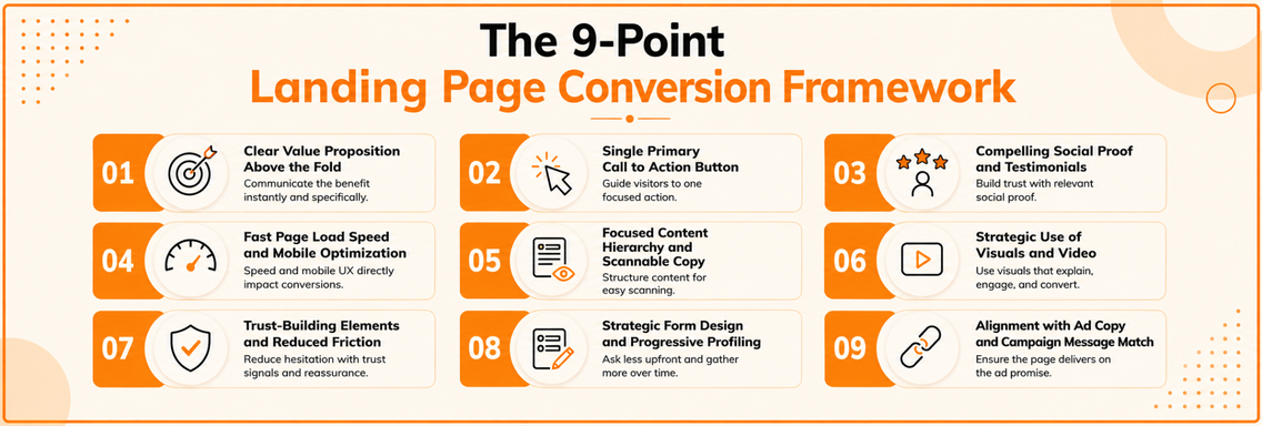
6. Strategic Use of Visuals and Video
Visuals should explain, not decorate. A screenshot, product demo, or service process graphic is useful only if it moves the visitor closer to understanding the offer. Generic stock imagery usually does the opposite because it fills space without answering any question.
Video is especially effective when the offer is complex, technical, or process-heavy. A short explainer helps when the visitor needs to see how the product or service works before they’ll commit. But video should stay concise, captioned, and performance-friendly, because a slow or bloated embed can undo the benefit.
Match the medium to the message
Use product walkthroughs for software, workflow demos for services, and customer footage when trust matters most. Slack, Loom, Calendly, and Shopify all show that a visual can do real conversion work when it clarifies the next step instead of just looking polished. If the offer is simple, a strong still image may outperform video because it loads faster and gets to the point sooner.
Keep captions on, keep file size under control, and test autoplay versus click-to-play. If you use customer photos or testimonial clips, make sure the visuals support the promise made in the headline. A great page doesn’t ask the visitor to imagine the value, it shows the value in context.
7. Trust-Building Elements and Reduced Friction
Trust is what closes the gap between interest and action. Visitors hesitate when they’re unsure about privacy, payment, cancellation, or whether the offer is worth the risk. Trust-building elements answer those concerns before the form or CTA becomes a barrier.
The best trust cues are concrete. “No credit card required,” “30-day money-back guarantee,” and clear privacy language reduce anxiety better than vague reassurance. Security badges, transparent policy summaries, and recognizable payment icons can help too, especially when the visitor is being asked to share data or spend money.
Put reassurance at the point of risk
Place trust elements beside forms and close to the CTA, where doubt tends to peak. If you’re asking for personal information, say what happens to that information in plain language. If you’re asking for payment, remove ambiguity around billing and cancellation.
For early-stage brands, founder credibility can help. For established brands, customer logos and reviews can carry more weight. The goal is not to overwhelm the page with seals and guarantees, it’s to remove the specific objections that keep a visitor from moving forward.
” Trust elements work best when they answer a real fear, not when they’re stacked on the page as decoration.
8. Strategic Form Design and Progressive Profiling
A form is often where the page earns or loses the lead. Every extra field adds resistance, so the form should ask for only what the visitor is ready to give. The opening capture form should stay lean, and the follow-up process can collect the rest later. As noted in landing page statistics, shorter forms often outperform longer ones, but the lesson is to reduce effort at the first point of contact.
That does not mean every lead should stay vague. It means qualification should happen in stages. Capture the lead first, then use progressive profiling through follow-up emails, nurture flows, or later-stage forms to gather the details sales needs.
Design the form around completion, not data collection
Put the easiest fields first, keep labels outside the input box, and use one column on mobile. If the form includes conditional logic or smart defaults, those features should remove work for the visitor, not add decision fatigue. When the audience is mixed, ask only for the data needed to route the lead correctly and keep the first submission moving.
For a digital agency, the test should not stop at form-fill rate. Excellorix should compare a shorter form against a longer one, then measure lead quality, sales follow-up rate, and downstream revenue fit, not just raw submissions. That approach is also where conversion leak analysis across websites helps, because form friction often shows up as a hidden drop between interest and qualified pipeline. A page that captures fewer but better leads can improve sales efficiency and LTV even if the top-line conversion rate looks lower at first.
9. Alignment with Ad Copy and Campaign Message Match
A landing page should keep the promise made in the ad. If someone clicks “Free SEO Audit,” the page needs to confirm that offer at once, not send them to a broad services page. Message mismatch creates friction, and friction lowers conversions.
Paid media makes this even more visible. When the headline, offer, and visual tone match the campaign, visitors know they are in the right place. That consistency also makes measurement cleaner, because your team can see which ad and page combinations are producing qualified conversions and which ones are wasting spend.
Build one page around one campaign promise
Use a dedicated landing page for each campaign theme instead of one page for every ad variation. Mirror the ad headline as closely as possible in the page H1, keep the imagery aligned, and use the same language around the offer. If the ad speaks to a specific audience, the page should speak to that audience too.
Keep the match close enough that the user does not need to reinterpret the offer. The faster that recognition happens, the less work the visitor has to do before deciding to act. For Excellorix, that usually helps ROAS first, because campaign-specific pages give paid traffic a clearer destination and make weak message alignment easier to spot in testing. As explained in our guide on what happens after the click, post-click consistency is where many campaigns either keep momentum or lose it.
A useful A/B test is simple. Keep the offer the same, then compare a page that mirrors the ad wording tightly against one that uses broader brand copy. Track conversion rate, lead quality, and downstream revenue fit, not just raw submissions. A page that produces fewer but better leads can improve sales efficiency and LTV even if the first conversion number looks softer.
9-Point Landing Page Best Practices Comparison
| Item | Implementation Complexity  | Resource Requirements  | Expected Outcomes   | Ideal Use Cases | Key Advantages  |
|---|---|---|---|---|---|
| Clear Value Proposition Above the Fold | Medium, iterative copy testing & alignment | Low-Medium, copywriting + design time | High, often lifts conversions 20-30% by improving relevance | Paid landing pages, B2B revenue pages, hero sections | Immediate clarity; reduces bounce; aligns with ad messaging |
| Single Primary Call-to-Action (CTA) Button | Low, design + placement decisions | Low, minor dev and design work | High, reduces decision friction; improves conversion focus (~15-25%) | Product pages, signup funnels, mobile-first flows | Focuses user action; simplifies tracking; improves mobile UX |
| Compelling Social Proof and Testimonials | Medium, collection, vetting, placement | Medium-High, content creation (video/photo) & legal sign-off | High, can increase conversions 20-50% when authentic and relevant | New brands, high-consideration B2B, ecommerce product pages | Builds credibility, reduces anxiety, supports persuasive claims |
| Fast Page Load Speed & Mobile Optimization | High, engineering, monitoring, ongoing fixes | High, developer time, CDN, tooling, audits | High, improves conversions 10-30%; SEO gains (Core Web Vitals) | Mobile-heavy traffic, ecommerce, high-traffic sites, global audiences | Better UX, lower bounce, measurable ROI, improved search rankings |
| Focused Content Hierarchy & Scannable Copy | Medium, copy + UX structuring and testing | Low-Medium, copywriter + designer time | Medium-High, increases engagement/scroll depth 30-40% | Feature pages, product descriptions, long-form landing pages | Improves comprehension, accessibility, and modular testing |
| Strategic Use of Visuals & Video | Medium-High, production, editing, optimization | High, production costs, hosting/CDN, captions | Medium-High, video can boost conversions 20-80% depending on quality | Demo-heavy products, complex features, storytelling campaigns | Communicates complex ideas quickly; increases engagement and trust |
| Trust-Building Elements & Reduced Friction | Medium, legal review + UX placement | Low-Medium, badges, copy, backend policies | Medium-High, reduces abandonment 10-30%; increases trust | Checkout flows, payment forms, high-consideration purchases | Lowers objections, clarifies policies, supports compliance |
| Strategic Form Design & Progressive Profiling | Medium, conditional logic, CRM integration | Medium, dev, CRM setup, analytics | High, reduces form abandonment 20-40%; improves lead volume/quality | Lead gen, SaaS demos, event registrations, checkout optimizations | Balances conversion vs. data collection; improves lead qualification over time |
| Alignment with Ad Copy & Campaign Message Match | Medium, build multiple pages and coordinate teams | Medium, extra pages, campaign ops, QA | High, increases conversions 10-40%; improves Quality Score & ROAS | PPC campaigns, paid social, segmented audience landing pages | Meets visitor expectations, lowers bounce, clarifies attribution |
Build Your Next High-Converting Landing Page
The strongest landing pages aren’t built from a checklist alone. They’re built from a sequence of decisions that help a visitor understand the offer fast, trust it quickly, and take one clear action without friction. If you audit your current pages, start with the highest-value fixes first, your value proposition, CTA clarity, and mobile speed.
That order matters because those three elements affect the page before the rest of the content even gets a chance. A weak headline creates confusion, a hidden CTA creates hesitation, and a slow mobile page loses attention before trust can form. Once those basics are in place, social proof, visuals, form design, and message match can do the rest of the conversion work.
For Excellorix, landing page design should always connect back to business outcomes. The page isn’t successful because it looks polished, it’s successful because it supports ROAS, improves lead quality, and creates a cleaner path to revenue. That’s the standard to use when evaluating every test, every redesign, and every campaign-specific page.
If you want landing pages that are designed around speed, message match, and conversion outcomes, Excellorix can help plan, build, and optimize them as part of a broader growth system. Visit Excellorix to explore landing page design, CRO, paid media, and website development support for your next campaign.